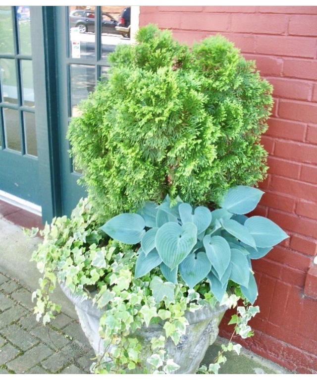
What’s wrong with this picture? The container needs to be about 6”—to the left to the left—(shoutout Beyoncé!) Here’s why, the various shades of green foliage reallllllly clash with the burgundy wall. There are a lot of undertones in these greens (like yellow and gray) and they are fighting each other! And guess what? Ain’t nobody winning y’all—and that’s why it’s clashing.
If you move the container over just a wee bit, it will be in front of a window trimmed in dark green. Now it becomes more of Monochromatic design (a design featuring variations of one color.) In this case Green. You save the design and it didn’t cost you a dime to fix the error. You’re welcome!

